

Logo's Symbolism
- About
- Logo's Symbolism
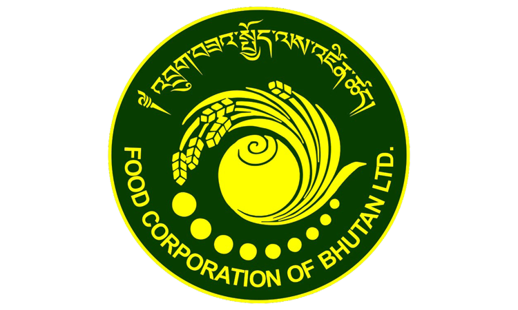
T he uniquely designed logo of the Food Corporation of Bhutan Limited (FCBL) perfectly resembles its socially driven mandates and responsibilities aimed at serving the King, Country and People.
At the centre of the logo is the priceless gem (ནོར་བུ). It symbolises FCBL as a precious gem of the country. Similar to the gem, which is believed to possess natural power to fulfill one’s needs and aspirations, it signifies FCBL’s unique strength and ability to fulfill the requirements of food security for the nation at all time. The dark yellow colour of the logo symbolises the visionary royal foresight of His Majesty the Fourth Druk Gyalpo that has given birth to this prestigious company. The dark yellow also represents the value and importance of the company as precious gold.
The nine dots symbolises Dru-Na-Gu (Nine cereals). Since times immemorial, Bhutanese villagers, especially those residing in favorable temperate zone grew the nine food crops called the Dru-Na-Gu (Nine Cereals), which are rice (Bja or rey), maize (Gayza), wheat (Ka), barley (Nah), buckwheat (Bjo or Jarey), millets (Memja or Cham), pulses (Sem), oil seeds (Peka), and amaranths (Zimtse). In olden days, people who could cultivate nine crops were considered wealthy with all essential food items.
The Dzongkha letters on the top indicates the superiority of Bhutan’s national language and unique cultural identity. The green background broadly symbolises green crops that fill the food basket. It also indicates FCBL’s hope and fresh ideas aimed at bringing continued growth and development that can eventually blossom into financially secure economically stable and socially fulfilling company.
Overall, the logo is an expression of FCBL as a precious gem of the country; a leading national agency that ensures availability, accessibility and affordability of essential food items for people from all sections of the society.